Stanley Black & Decker,
2016 Year in Review
Visit Website
Stanley Black & Decker is a Fortune 500 American manufacturer of industrial tools and household hardware and provider of security products. In 2016 Stanley Black & Decker had a new CEO and a newly defined purpose; digital innovation and social responsibility. Hence, the company pursued to create improved interactive annual reports from previous years based on their new messages. Therefore, my team set up the three goals:
1. Deliver Stanley Black & Decker's newly defined message in completely refreshed visuals;
2. Straightforward navigation and user flow;
3. Visualizing the corporation's complex data and stock information into polished visuals.
Simplified Stories
My team broke down the company's stories into three significant sections and multiple secondary pages by collaborating content strategists and creative writers. Then we created the rapid wireframe to see the site pagination in a glance.
Landing Page
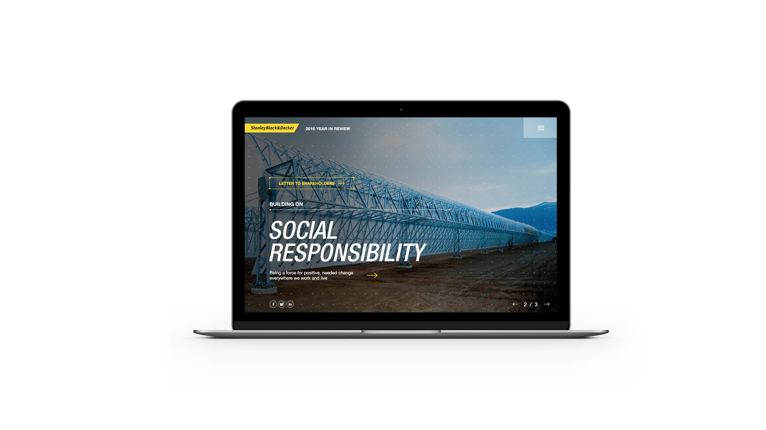
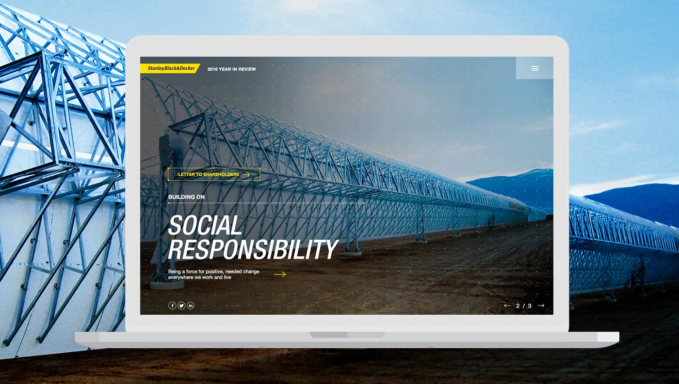
Landing page needs to attract visitors' attraction in a glance. Hence, I explored multiple visual concepts. In a result, I came up with animating typography and bold carousel animation on the landing page that lets users see the stories briefly and effectively.
Enhanced User Experience
My team created simple navigation system with seamless micro-interactions to focus on the content and create straightforward user journey at the same time. Creating simpler navigation system helped my team to categorize and balance the contents smoother. Also, we included other functionalities like content filters and jump-links for smoother user experience.


