Ecospaces Education
Rebranding & Website Refresh
Visit Website
EcoSpaces Education is a Newark, New Jersey based multidisciplinary program focused on education, nutrition, and health. Since Ecospaces Education lacked identity and functional website, our team's goal was to support their growth plans as they expand from one school to many, and create a knowledge hub for educators, the foodservice industry, and the Newark community. My team's primary goal for refreshing identity and online platform for Ecospace Education were:
1. Focusing on their mission that are nutrition, agriculture, and robust education
2. Playful and friendly vibe to let parents entrust their kids to Ecospaces Education
3. Robust and visual website to allow Ecospaces Education to be acknowledged by international institutions and the public.
After rebranding and new website has been launched, Ecospaces Education has been recognized by First Lady Michelle Obama, as a program that supports all of the efforts of her Let’s Move Healthy School initiatives, and was recognized as a leader in the National School Lunch Program, as innovators in alternative healthy lunch options by the USDA.
Brand & Identity
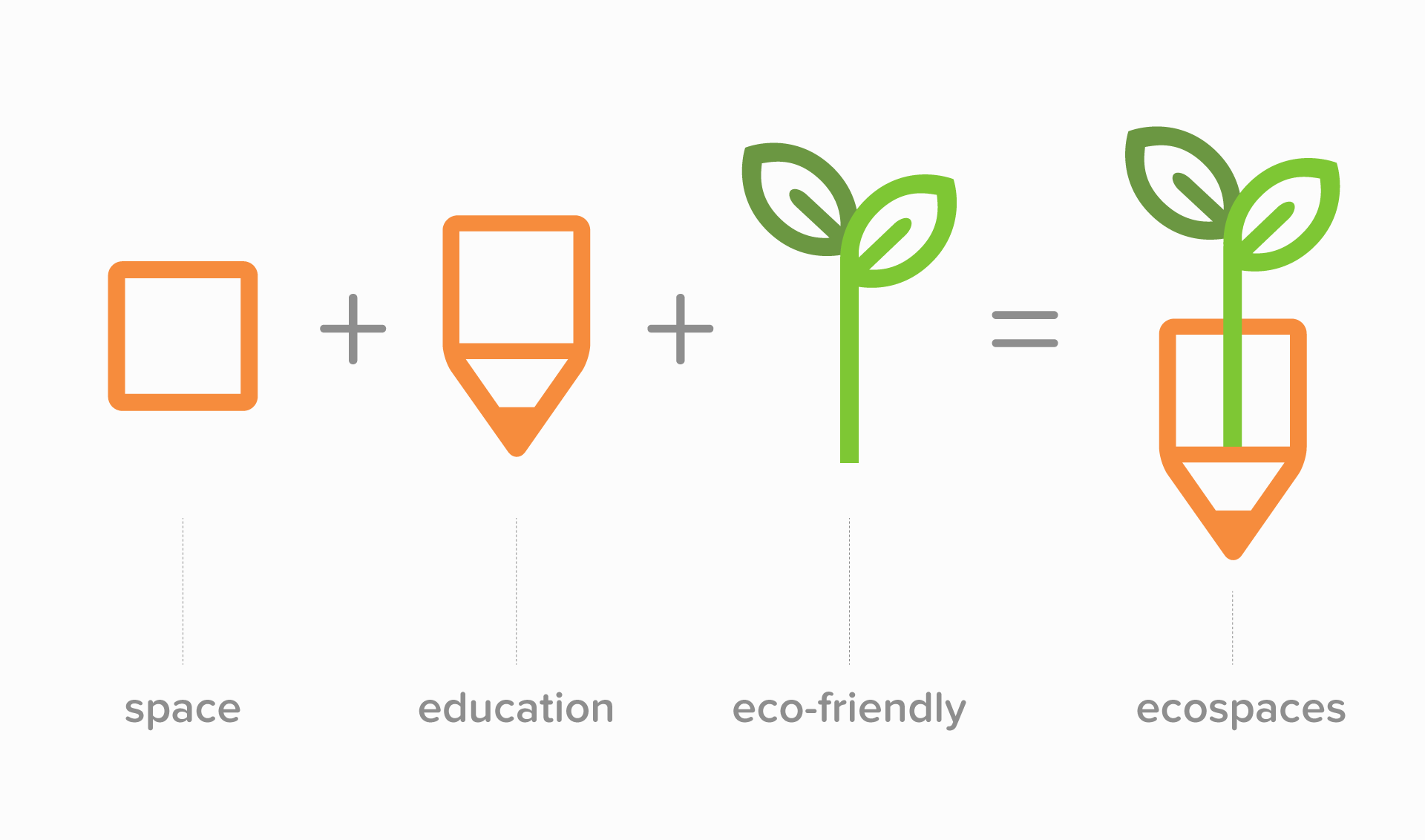
Ecospaces Education cultivates and cooks their food for kids to teach vital relationship of food to agriculture and how food affects the quality of our everyday lives. My team came up with a logo with combining a pencil (education) and sprout (nutrition) shapes to evoke their priority mission and playful education vibe. After Ecospaces Education's approval of logo, we continued creating the stationery design, including letterheads, business cards, postcards, and so on.
Digital Platform (Process)
Ecospaces Education had not been publicizing their name, so they needed public attention on online. Before beginning designing, our team roughly did brainstorming about pagination, priorities, keywords, what's need to be featured, and so on. This process helped us a lot with coming up with the visual concept and crafting user experience.
Digital Platform (Results)
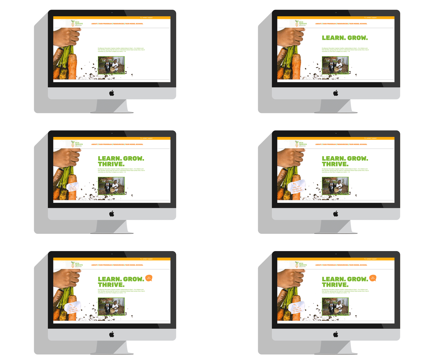
Since their main priority is food and nutrition, my team decided to feature their harvest of the month on the landing page that changes monthly. Then we figured out 'Educators,' 'Food Services,' and 'Community' are the three primary keywords that users would find. Therefore, we featured on the landing page to allow users to access quickly. Also, we used the direction of using organic shaped GUIs, bouncy micro-interaction, and environmantal photos regarding the target audience, parents and people from education and food industry.
Landing Page Animation
Landing Page & Interior Page on Desktop
Landing Page & Search & Navigation on Mobile
Navigation & Breadcrumb
How the product works in mobile
Awards
Ecospaces Education rebranding & new website website won:
- Standard of Excellence WebAward from Web Awards 2017
- Best of Show from 2016 iNova Awards
Credit
Client: EcoSpaces Education
Creative Director: John Connolly, Darren Namaye
Identity Designer: Frederick Lee
UX & UI: Frederick Lee, Brett Robinson
Project Manager: Morgan Sendor
Photography: Peter Ross
Web Development: Igicom
Printing: DCC
MS Office Tools: Office Roi


