

Kids in Crisis Website Refresh
Visit Website
My team launched second "BrandNewBrand," which was pro-bono rebranding & website refresh for non-profit organizations (see details for the first winner, Ecospaces here). 2017 winner was Kids in Crisis, a non-profit organization where provides 24/7 support to help children and families resolve the conflict. The organization offers emergency shelter, prevention workshops, in-school counseling, an emergency hotline and much more to kids, teens, and families struggling with abuse, bullying and mental health. My team's primary goal for Kids in Crisis's new website were:
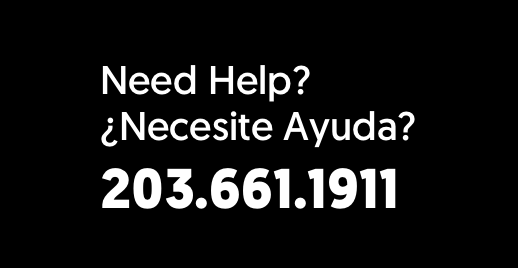
- Featuring the organization's phone number upfront to make it visible anywhere on the website to let people in emergency can contact Kids in Crisis;
- Visual that evokes an urgency and intimacy simultaneously;
- Allow people to easily know what Kids in Crisis do.
Landing Page Animation
Brainstorming & Rapid-Prototyping
Kids in Crisis's primary target-audience is always potential callers who are in danger or witnesses of emergencies. Based on this, my team brainstormed how the final product can evoke urgency and reveal organization's phone number conclusively. Then we jumped on visual design explorations, UX/UI design guideline for desktop & mobile, and rapid-prototyping.
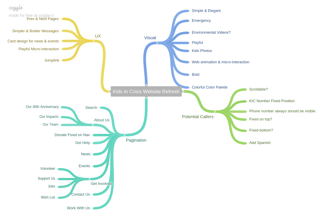
Brainstorming & Research
Visual Exploration in Sketch

UX&UI Guideline for Desktop & Mobile Breakpoint
Rapid-Prototyping for Micro-Interactions
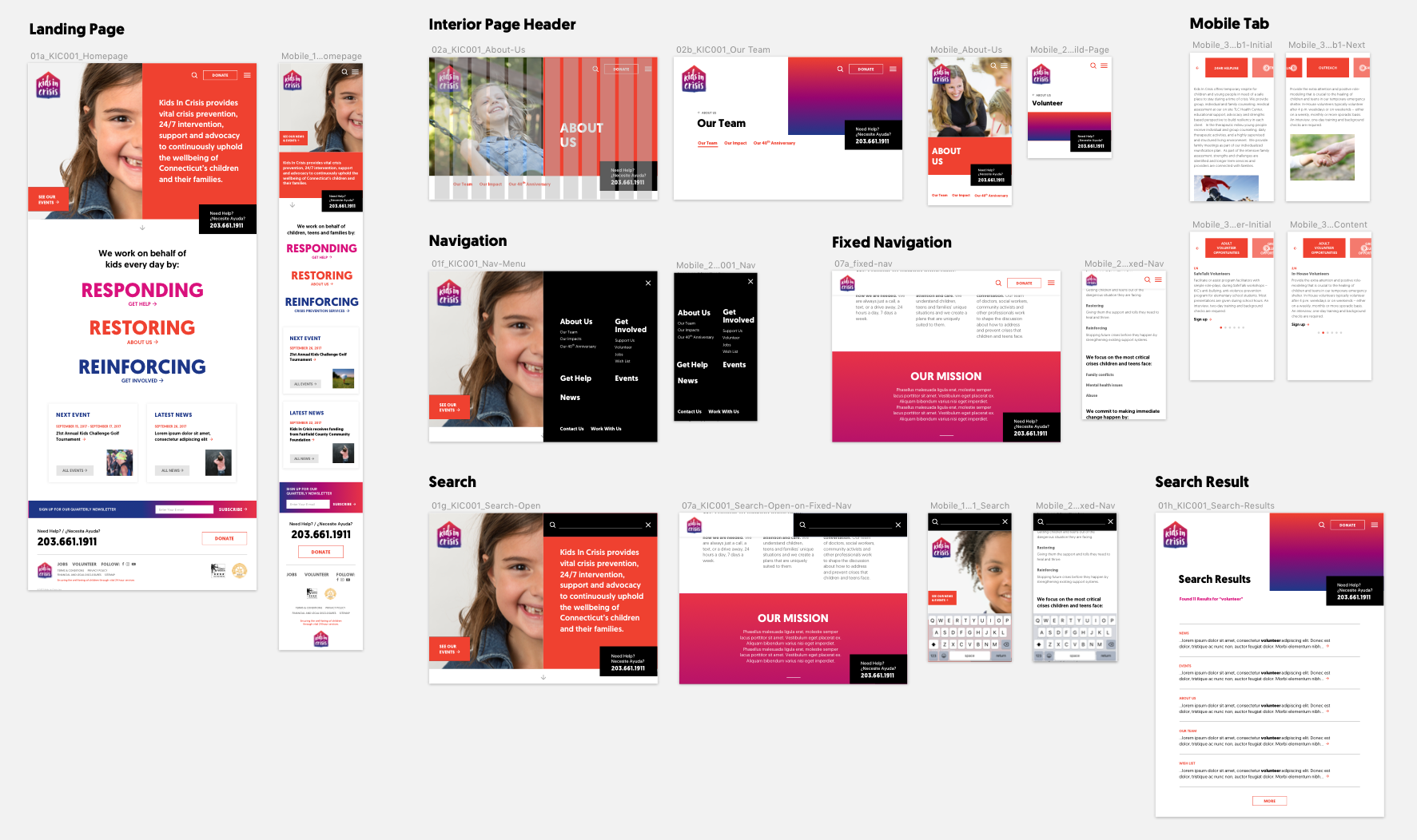
Landing Page
Saving more kids from dangers and abuses is what Kids in Crisis's goal. Hence, my team decided to feature a slideshow of photos of real kids in an organization with their primary message inside the gradually shifting color block because we wanted to alert how making calls to Kids in Crisis will save many kids. Also, landing page also features organization's three primary missions as well as latest news and event.
Landing Page Experience (Desktop)
Landing Page Experience (Mobile)
Need Help?
The primary purpose of the website is letting visitors in emergency to call the organization as quickly as possible so "Need Help?" box is in fixed position at the right-bottom, visible anywhere in the website. In case the users access the website on mobile, the phone number is tappable so users can call the number right away.
Interior Pages
Interior pages follow the 5:5 layout from landing page. Each parent page has unique primary color palette and child pages use the same gradient from the logo. Parent pages with child pages include secondary navigation on top and bottom of the pages to enable smoother user experience.
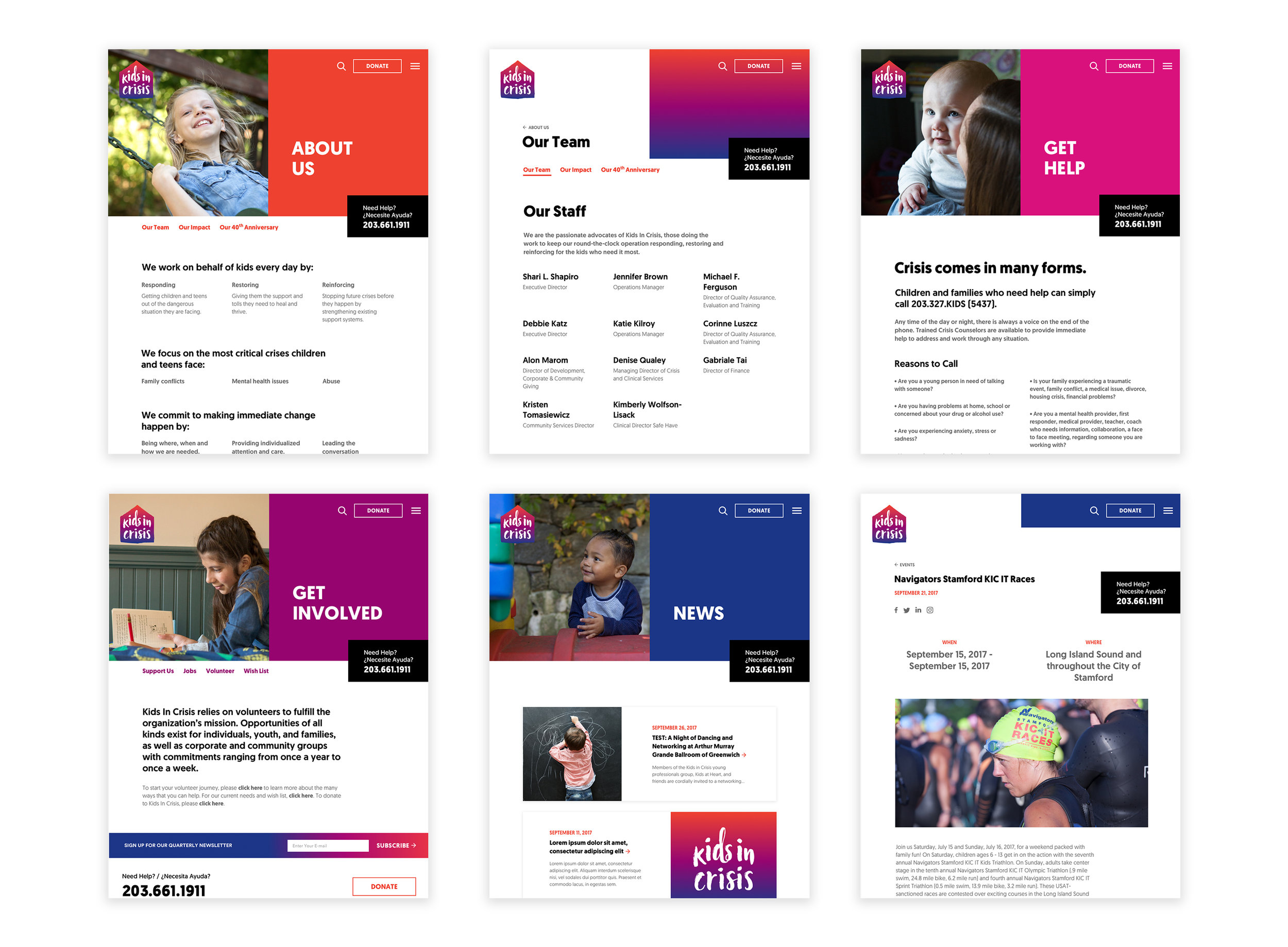
Parent & Child Pages
Secondary Navigation
Search & Navigation
Search & Navigation Micro-Interaction in Desktop and Mobile
Awards
Kids in Crisis Website Refresh won:
- American Web Design Awards
Credit
Client: Kids in Crisis
Design & Development: ideas on purpose
Product Designer: Frederick Lee
Brand Designer: Isaac O'Neill
Creative Director: Darren Namaye & John Connolly
Strategist: Michelle Marks
Project Manager: Morgan Sendor
Developer: Joe Maller
Photographer: Peter Ross
Photo Retoucher: David Lee Myers