Stanley Black & Decker,
2017 Year in Review
Visit Website
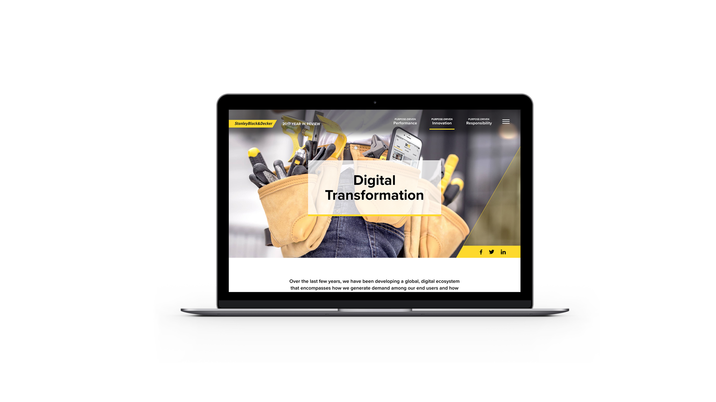
Since Stanley Black & Decker was satisfied with the 2016 Year in Review site, my team could have a chance to work on the 2017 Year in Review. You can visit 2016 Year in Review case study here. Since the company had refreshed visuals and updated contents from 2016, my team's primary goals were:
1. User-centric approach with featuring the company's working environment and products;
2. Straightforward visuals and reflecting Stanley Black & Decker's new visual guideline;
3. Efficient and speedy design process.
Enhancing User Experience & Rapid Prototyping
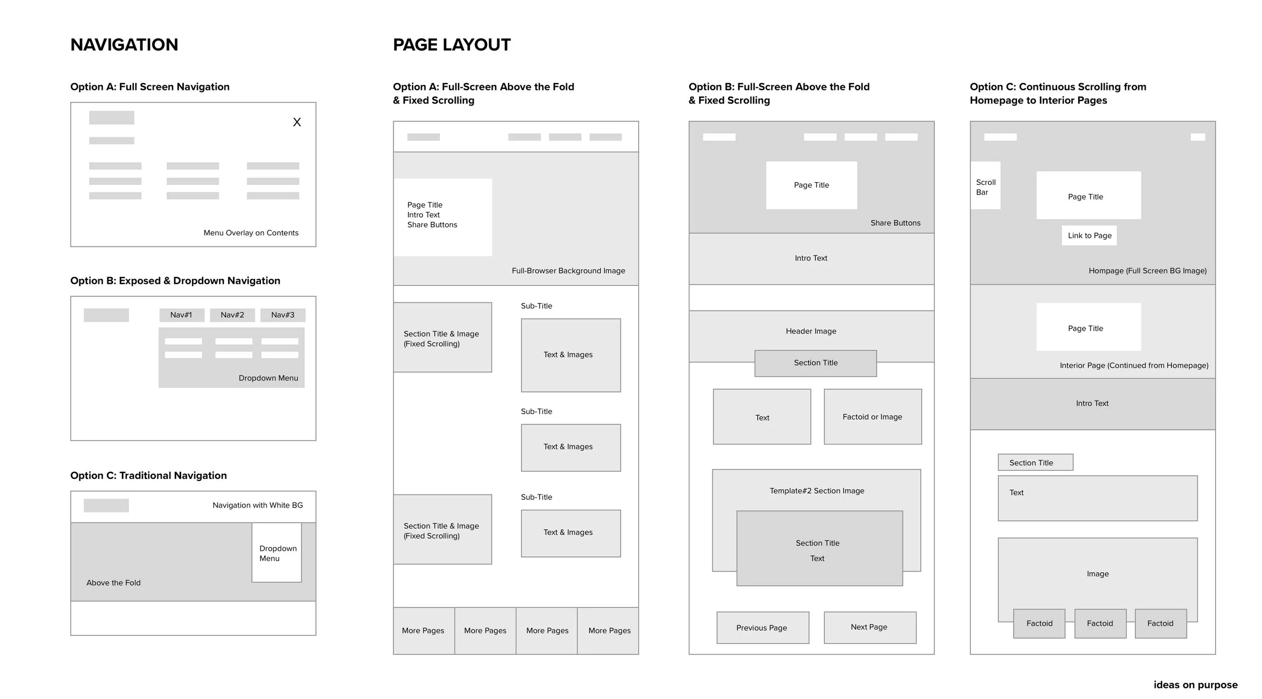
My team explored various design options to achieve the goals mentioned above, considering "how users can navigate smoother without any interruption" and "how each story can be more prominent and readable". To speed up the initial stage, I did the rapid prototyping for various design options by using Principle App to present web interactions to the client in an earlier stage. Below are the design explorations and four rapid prototypes I did.
Rough page layout exploration as a wireframe format before rapid prototyping
Four rapid-prototyping with using Principle App
Landing Page
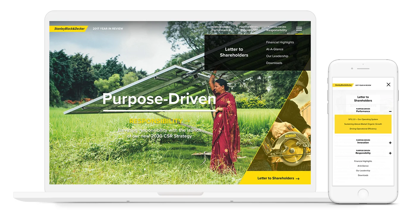
In 2017, Stanley Black & Decker began to use own visual guideline, concentrating on using customized 'X' shape filled with the images (example on the right). Therefore, we came up with three slides carousel with revealing the slight hint of next slide and link to the letter page on the right triangle.
Landing Page Animation
Interior Page
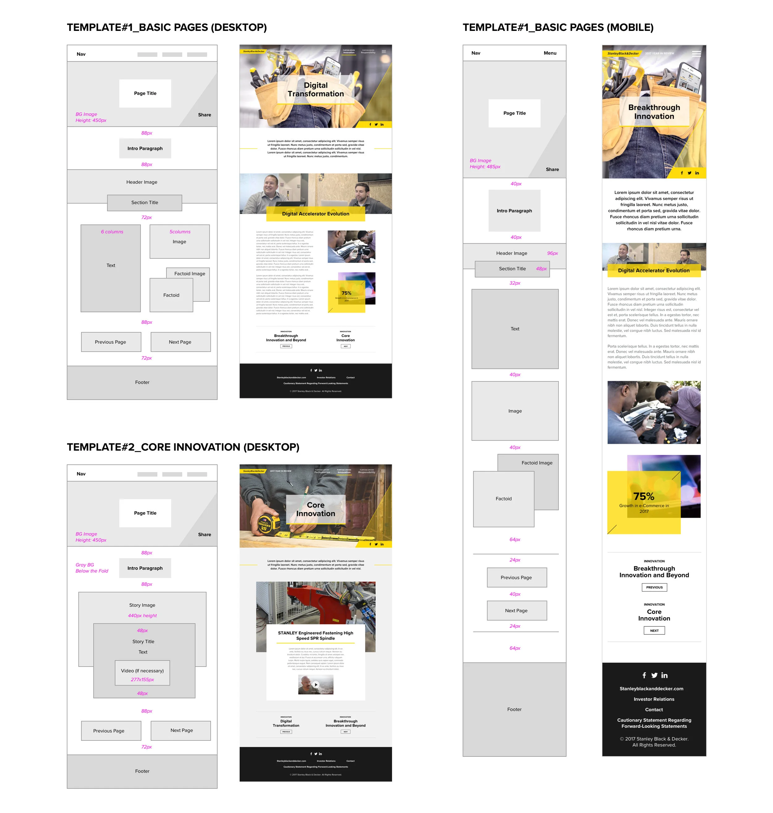
My team learned from 2016 that there would be many back-and-forth changes such as text, images, facts, and so on. Hence, we created the basic pages template with spacing and size rules as well as other unique pages (there were four templates). This direction allowed us to work with clients and programmer more efficiently and quickly.
Navigation
After decision makings and client approval, my team began developing designs. We decided to proceed with revealed navigation to separate three primary menus from other pages. Links to pages are added to the drop-down menu, and on-state yellow bar indicates users know where they are.
How Navigation Works in Desktop Breakpoint
How Navigation Works in Mobile Breakpoint
Hierarchy
To visualize what Stanley Black & Decker do, their achievements, and working environment, so we asked the client for their corporate videos to feature on the video page header, and highlighted the stories by dominant section image header and eye-catching web-animation. This direction helped to generate better visuals and hierarchy.
Video Page Header with Web Animation
Story Layouts with Web Animation
Smooth User Journey
Unlike the 2016 Year In Review, each primary section (Performance, Innovation, Responsibility, and Utility Pages) includes multiple pages, so the product offers the link to previous and next page to prevent dead-ends. In this way, users can navigate the site quickly without going back to the menu again.
Infographic Interaction
Same as 2016, Stanley Black & Decker had lots of data and information to feature in 2017. Hence, my team simplified their contents into animating or interactive infographics and factoids to let users to see the complicate data at a glance. One of the outstanding infographics was 'Materiality Matrix' that included tons of data. Hence, my team decided to add an interaction as we created the chart and keys so that their data can be presented more playful and visual way. You can visit this infographic here.
Materiality Matrix Interactive Infographic
Awards
Stanley Black & Decker 2017 Online Year In Review won:
- Recognition from American Web Design Awards
Credit
Client: Stanley Black & Decker
Design & Development: ideas on purpose
Product Designer: Frederick Lee
Creative Director: John Connolly
Strategist: Michelle Marks
Project Manager: Morgan Sendor
Developer: Chris Manlapid
Creative Writer: Steve Starbuck


